
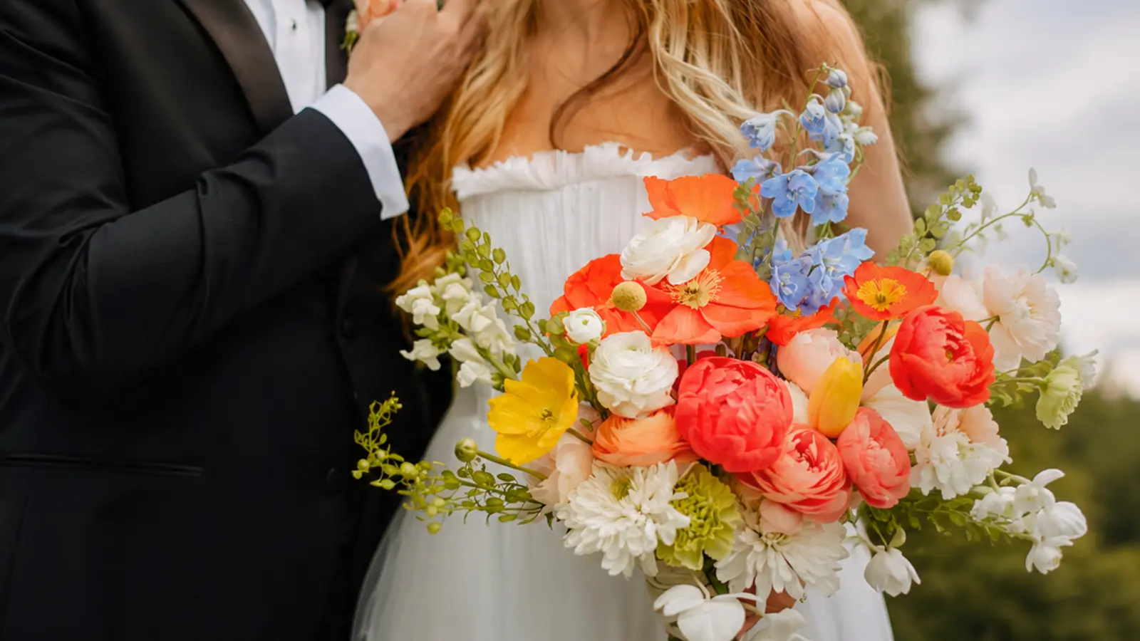
Wedding bouquet colors do much more than determine how your flowers look—they influence how your bouquet complements your dress, photographs throughout the day, and connects with the overall design of your wedding. While many brides begin by choosing a favorite color, the most beautiful bouquets are usually built around carefully balanced palettes rather than a single shade.
Professional florists rarely think in terms of one color alone. Instead, they combine an anchor color with complementary tones, greenery, and seasonal flowers to create depth, contrast, and harmony. Understanding how those elements work together makes it much easier to choose a bouquet palette that feels cohesive instead of relying on inspiration photos alone.
This guide explores how color shapes wedding bouquets, including how to build a balanced palette, coordinate with your dress and bridesmaids, choose seasonal combinations, understand how bouquets photograph in different lighting, and create a color story that feels timeless and beautifully intentional.
Think in Palettes, Not Single Colors
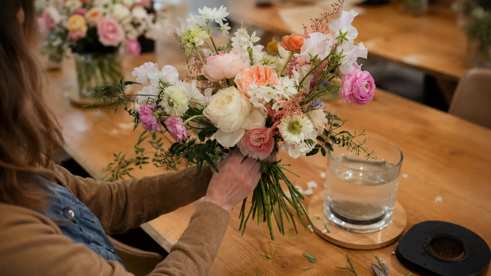
Choosing a single color for your bouquet and asking your florist to build from there is a reasonable starting point, but it often produces results that look flatter than expected. A bouquet built on one color alone — all blush, or all white, or all deep burgundy — can feel visually one-dimensional even when the flowers are beautiful, because the eye has nothing to move between. Depth in florals usually comes from tonal variation: a dominant color, a secondary tone that complements it, and a neutral or greenery element that creates breathing room.
The two-to-three color framework is how most experienced florists think about bouquet composition even when clients request a single color. If you ask for a “white bouquet” a good florist will typically build it with white as the anchor, soft cream or ivory as a secondary tone, and sage or silver greenery to prevent it from reading as a flat white block. Understanding this helps you give better direction from the start — rather than naming a single color, you can identify the anchor and the range you want around it.
This also makes the conversation about flowers more productive. Instead of searching for wedding bouquet flowers in one exact shade, you can discuss which blooms anchor the color, add depth, and provide contrast — which is how a bouquet actually gets built.
Where to Pull Your Palette From
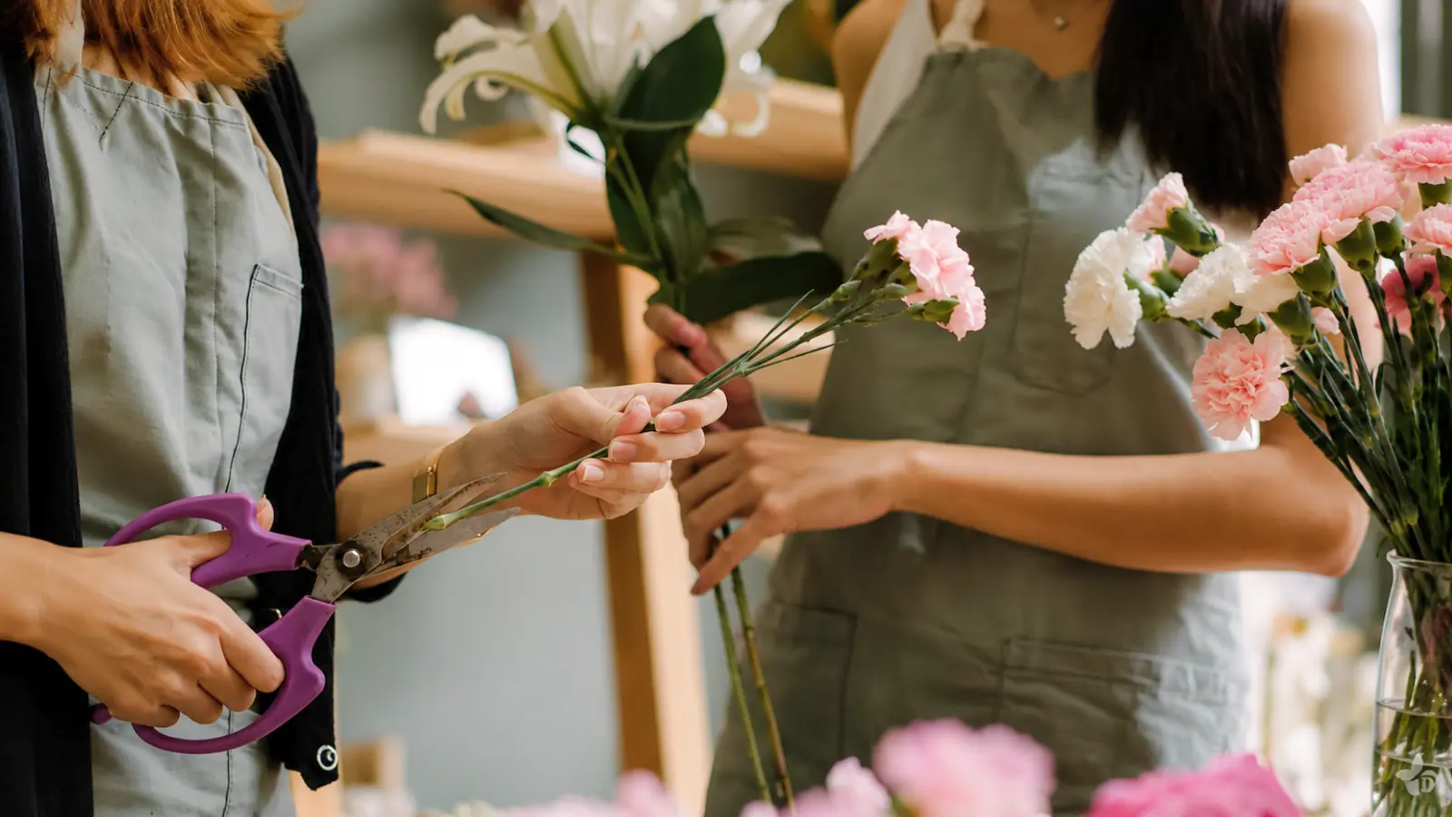
The most cohesive bouquet palettes come from sources already present in the wedding, not from selecting a color you like in isolation. Starting from what’s already decided — dress details, bridesmaid colors, venue, season — gives the bouquet a foundation that connects it to everything else rather than making it feel like a separate decision.
Your dress. Not “white” as a category, but the specific tone. Warm whites and champagne dresses pair better with warm palette choices; cool bright whites read better alongside cooler tones. This single input can rule out an entire color temperature before you fall in love with a palette that fights your gown.
Bridesmaid dress color. When planning wedding bouquets for bridesmaids, the bridal bouquet doesn’t need to match them exactly, but it should coordinate. If your bridesmaids are in sage, the bouquet might pull warm blush and ivory alongside it, or lean into the green family with deeper jewel tones. If they’re in dusty blue, the cooler palette associated with blue wedding bouquets may coordinate more naturally than heavy warm terracotta — unless that contrast is intentional.
Venue and décor. A garden covered in greenery creates a different backdrop than a ballroom with ivory linens. Warm earthy tones can recede slightly against a heavy outdoor green backdrop; a palette with more contrast will read more clearly. In a formal ballroom with gold accents, deep burgundies and rich champagnes tend to hold better than very cool, muted tones.
Season. Season influences which flowers are available at their best — and those flowers carry inherent colors. Peonies run blush, coral, and white. Dahlias peak in terracottas, mauves, and caramels. Working with seasonal color means better flowers at more accessible prices, and a palette that feels natural rather than forced.
Monochromatic, Mixed, and Contrast Palettes
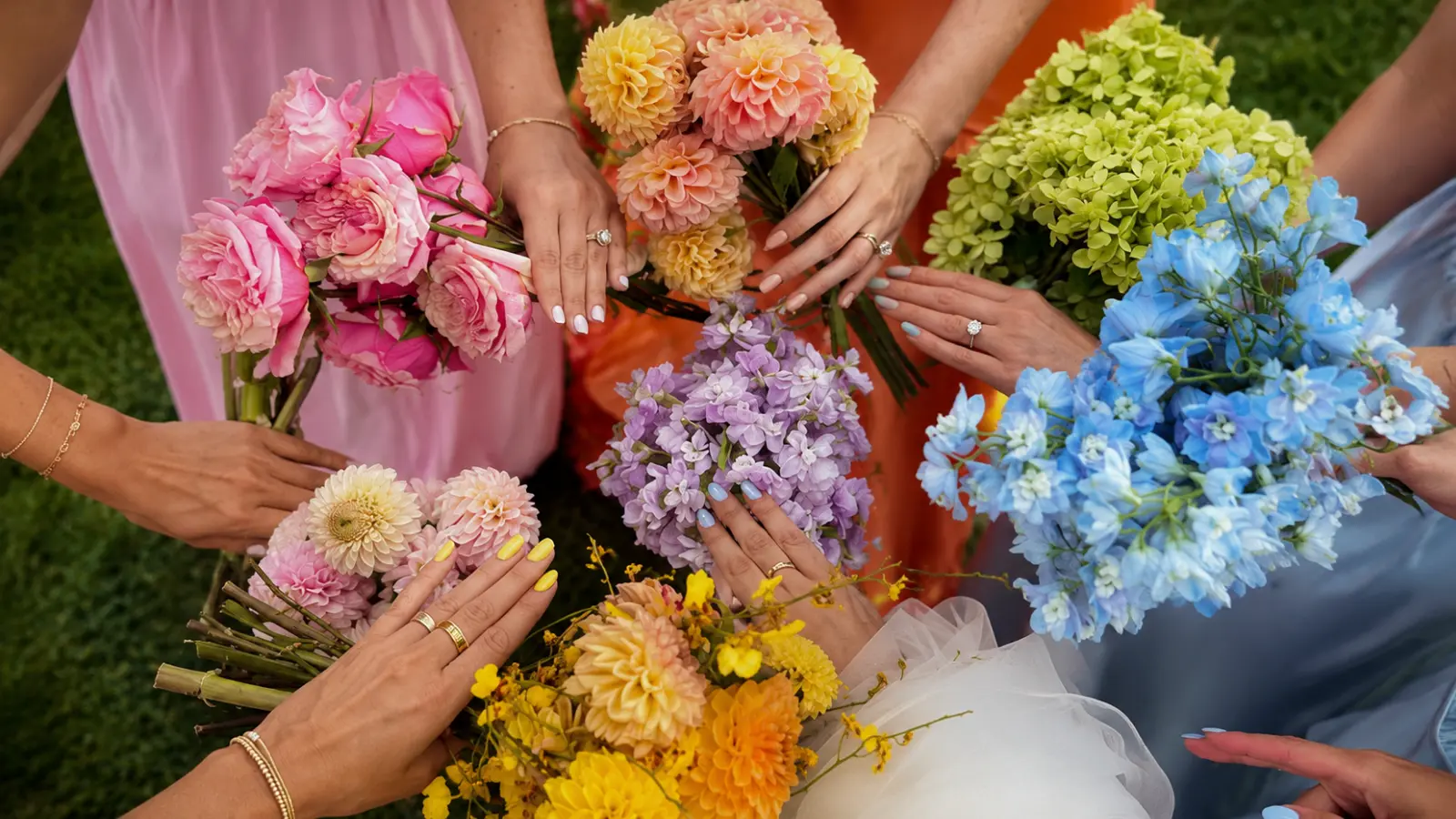
Once you have a starting anchor color, the structure of your palette shapes the overall visual impression of the bouquet. There are three main approaches, each producing a meaningfully different result.
Monochromatic palettes use one base color in a range of tones, as seen in red and burgundy wedding bouquets, or in palettes that move from white through ivory to champagne. The effect is sophisticated and cohesive, particularly in formal or minimalist wedding settings. The risk is that without textural variation in the flowers themselves, a monochromatic bouquet can feel flat. The fix is usually in the flower selection: varied petal textures, bloom sizes, and shapes keep a single-color palette visually interesting even when the color range is narrow.
Mixed palettes form the foundation of many colorful wedding bouquets, using two or three distinct colors that share an undertone or temperature. A warm mixed palette might combine terracotta, peach, and ivory. A cooler version might pair dusty mauve, soft lavender, and white. The shared temperature is what makes a mixed palette feel intentional rather than chaotic. Mixed palettes are versatile across venue types and tend to be the most florist-friendly because they give more flexibility in flower selection.
Contrast palettes use colors that sit opposite or far apart on the color wheel — burgundy with ivory and sage, for example, or cobalt blue with white and warm yellow. Contrast palettes make a stronger visual statement and photograph with more presence than softer palettes in most lighting conditions. They require more deliberate building because a miscalibrated contrast can feel jarring rather than intentional. One useful approach: keep two of the three palette elements in the same temperature and let the third create the contrast, rather than splitting the palette evenly between two competing tones.
Neutral Colors vs. Saturated Colors
Whether your palette leans neutral or saturated isn’t just an aesthetic preference — it has practical implications for how the bouquet reads in different environments and under different light conditions.
Neutral palettes — ivory, white, blush, champagne, soft sage — are the most universally adaptable. They work across seasons, photograph cleanly in both indoor and outdoor settings, and coordinate easily with a wide range of venue aesthetics. Their limitation is that they require more textural work to avoid looking flat. A neutral bouquet built of tight, similar-sized blooms in soft ivory can look undifferentiated in a photo; one with varied textures and bloom sizes reads as layered even with a quiet color story.
Saturated palettes — deep burgundy, rich terracotta, vivid coral, jewel-toned purple — make a stronger immediate visual statement and hold their presence in photos more easily than pale palettes. They read well against white gowns and green outdoor backdrops, and under interior lighting they maintain depth where pale palettes sometimes go muddy. The main calibration is ensuring the saturation is intentional: one very saturated bloom in a neutral arrangement functions as an accent, while building the entire palette at high saturation is a different and bolder commitment.
How Colors Perform in Photos
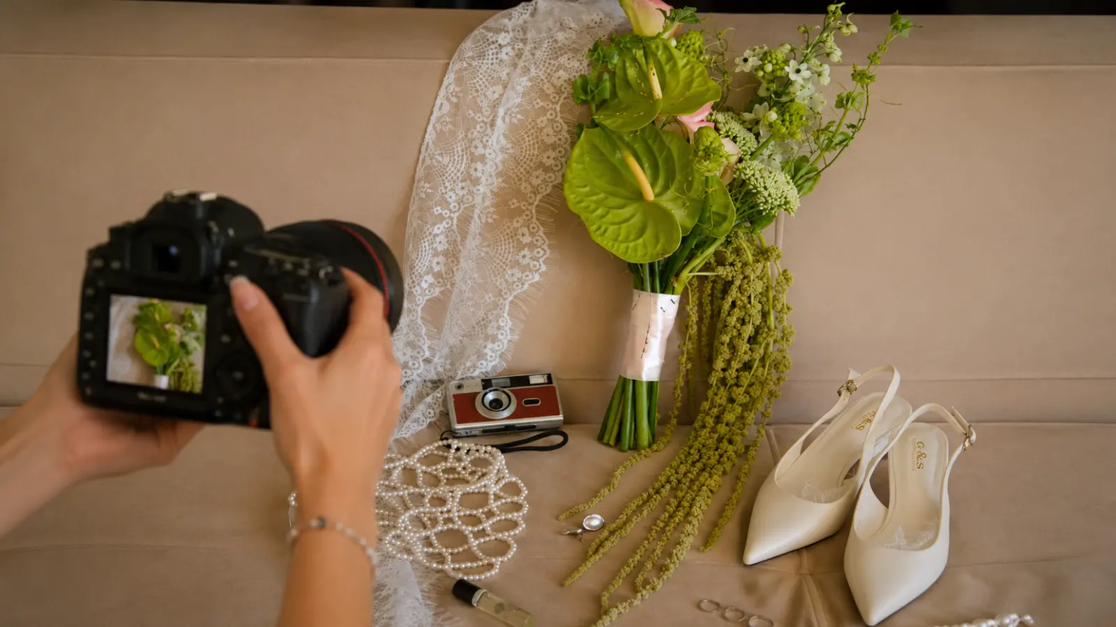
The gap between how a bouquet looks in person and how it appears in photographs is something brides consistently underestimate. Color behaves differently under natural outdoor light, warm indoor artificial light, and mixed venue lighting — and those differences matter specifically for the images you’ll have from your wedding day.
Outdoors in natural light, most palettes photograph accurately. Warm tones glow, cool tones stay true, and the overall rendering tends to be forgiving. The main risk outdoors is overexposure: very pale colors — soft ivory, white, lightest blush — can wash out against a bright sky, particularly in direct afternoon sun. Building in at least one deeper or more textural element prevents the bouquet from disappearing in full-length shots.
Indoors under warm artificial or mixed lighting, the rendering shifts. Warm tones deepen and become richer. Cool tones can drift — soft lavender may read more gray; dusty blue can lose distinction. The pale tones used in pastel wedding bouquets are especially vulnerable to looking flat or slightly muddy under warm event lighting. Deeper, more saturated colors hold most reliably across a range of indoor conditions.
Skin tone is also worth considering. Warm palettes — blush, peach, champagne, terracotta — tend to be broadly flattering across skin tones and add warmth to portraits. Very cool, pale palettes can occasionally wash out lighter skin tones under certain lighting. This doesn’t make cool palettes wrong — it makes a quick conversation with your photographer worthwhile before you finalize a very pale or very cool palette.
One question worth asking your photographer directly:
“Given our venue and the time of our ceremony, what palette considerations should I keep in mind for how the bouquet will photograph?” Most wedding photographers have a clear answer and a preference — and they’re looking at images from that specific venue, which is information your florist doesn’t have.
Greenery Is Part of the Palette
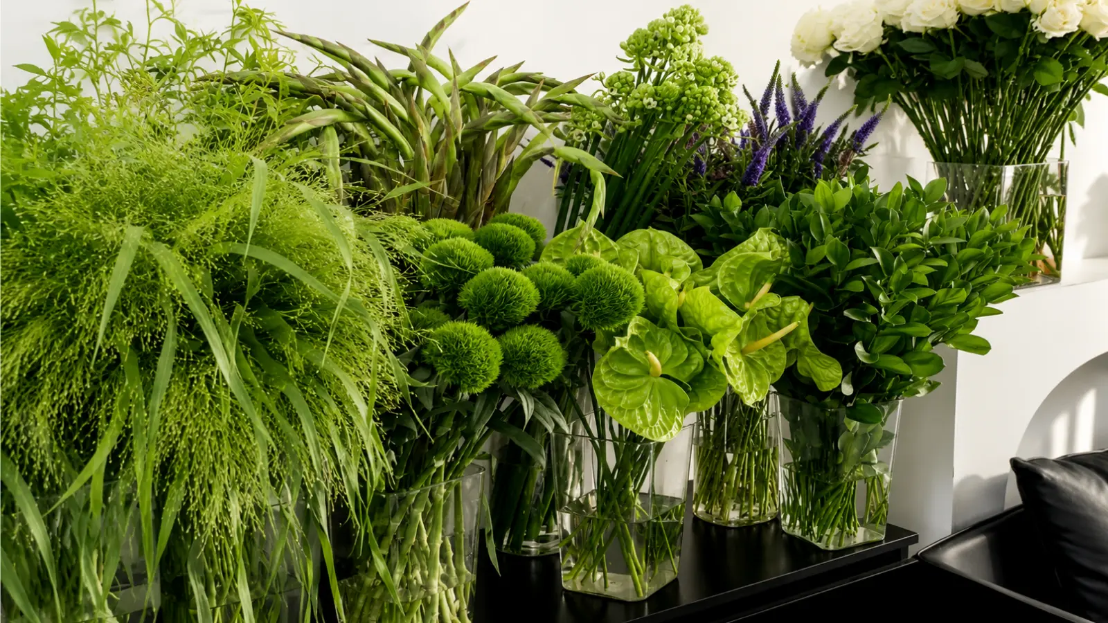
Greenery is typically discussed as a structural element — something that adds volume, fills space, and softens the arrangement. It is all of those things, but it’s also a color decision, and treating it as one from the beginning produces noticeably more cohesive results.
The range of greens available in bridal florals is wide, and they don’t all read the same way. In greenery wedding bouquets, silver dollar eucalyptus creates a cool, almost blue-green tone that works naturally with dusty rose, lavender, and white. Seeded eucalyptus is slightly warmer and more yellow-green. Italian ruscus has a deeper, more saturated green that adds structure and pairs well with jewel-toned or high-contrast palettes. Dusty miller is silvery-gray rather than green, which makes it an effective bridge element between cool colors. Ferns and tropical greenery bring a bright, warm yellow-green that reads very differently from the muted eucalyptus family.
Choosing greenery that reinforces your palette’s temperature rather than contradicting it is the simplest way to improve overall cohesion. A warm terracotta and peach palette with cool, blue-toned eucalyptus can feel slightly at odds with itself; the same palette with seeded eucalyptus or olive branch reads as unified. This is a detail worth raising specifically with your florist rather than leaving it as a default choice.
Palette by Season and Wedding Style
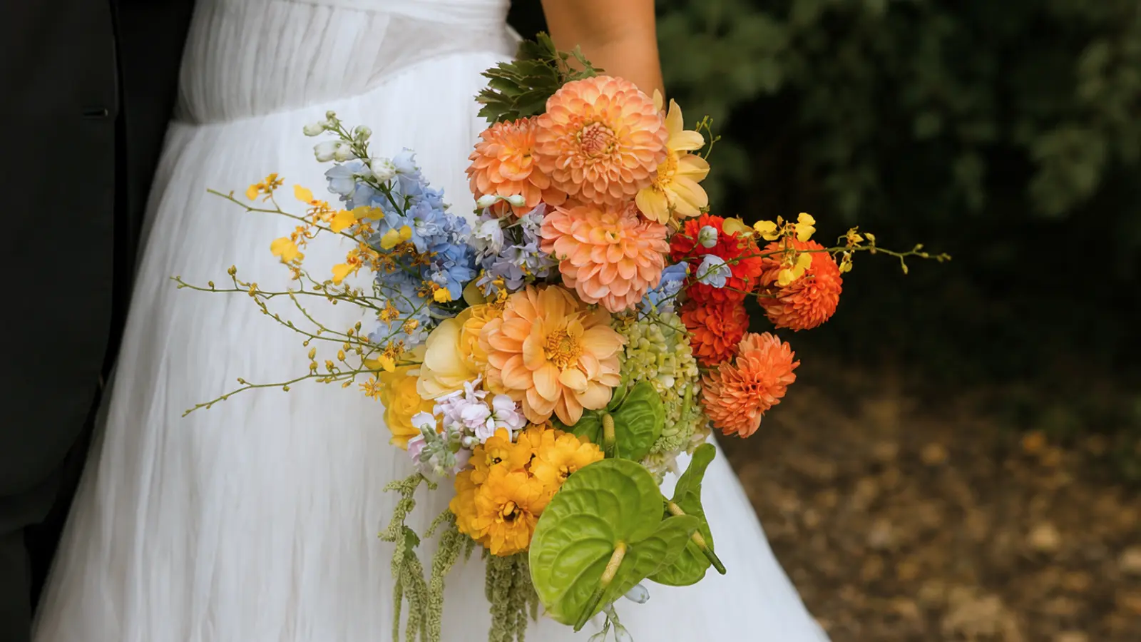
Palettes don’t exist in a vacuum — they land differently depending on when and where the wedding is. The table below connects palette types to the seasons and settings where they tend to work most naturally, based on both available flowers and overall aesthetic alignment.
| Season | Natural Palette Range | Works Best With |
|---|---|---|
| Spring | Blush, soft lilac, butter yellow, white, sage | Garden venues, romantic or garden-style weddings |
| Summer | Coral, peach, bright white, lavender, warm ivory | Outdoor ceremonies, coastal weddings, relaxed outdoor receptions |
| Fall | Terracotta, rust, caramel, deep burgundy, dusty mauve | Barn, estate, vineyard, or bohemian outdoor settings |
| Winter | Deep burgundy, plum, ivory, white, forest green, berry | Formal indoor venues, ballrooms, historic spaces |
These aren’t rules — a terracotta palette in spring is entirely viable if that’s the wedding’s aesthetic, and a soft blush bouquet in winter can be beautiful in the right setting. The table reflects what tends to feel most natural and what will make flower sourcing and pricing easiest, not what’s permitted. Florists can source most flowers across seasons, but choosing what is naturally peaking usually means better quality and a more manageable wedding bouquet cost.
Common Color Mistakes to Avoid
Most bouquet color problems are traceable to one of a few specific missteps — none of them obvious in advance, all of them avoidable once you know what to look for.
Choosing a color before building a palette. Selecting “dusty blue” because you love the color, without considering the dress tone, the bridesmaid colors, or how it reads in your venue’s lighting, often produces a bouquet that’s beautiful in isolation but slightly disconnected from everything around it. Color decisions made in context almost always produce more cohesive results than colors chosen independently.
Ignoring the specific white of the dress. There are warm whites, cool whites, ivory, and everything in between — and they don’t all pair the same way. A warm ivory dress next to a cool, pale lavender bouquet can make the dress read yellowed in photos. It’s a fixable problem once you know the dress tone, and an invisible one if you don’t account for it.
Not testing how a palette looks under your venue’s lighting. A palette built in a florist’s studio under bright fluorescent light may shift meaningfully under the warm candlelight and uplighting of an evening reception. If your ceremony and reception have distinctly different lighting, knowing how your palette behaves in both conditions — rather than assuming it will look the same — is worth the conversation with both your florist and photographer.
Treating greenery as colorless. Leaving greenery selection to default choices means you may end up with a color element that slightly contradicts your palette without anyone noticing until the arrangement is assembled. Specifying the greenery types — or at least the temperature of green you want — closes a gap that’s easy to overlook.
Building a palette that looks identical to the bridesmaids’ dresses. The bouquet should coordinate with the wedding party, not disappear into it. A blush bouquet held against a blush bridesmaid dress reads as one flat color block in photos. The bridal bouquet needs enough differentiation to stand apart visually — which is typically achieved through tone variation, texture, or the presence of additional palette colors the dresses don’t have.
Wedding Bouquet Color Inspiration
Discover wedding bouquet colors featuring timeless white and blush palettes, rich burgundy tones, seasonal flower combinations, elegant greenery, and beautiful color inspiration for every wedding style.
Great Bouquets Begin With Great Color Planning
Choosing wedding bouquet colors isn’t about finding a single beautiful shade—it’s about creating a palette that connects every part of your wedding. When your bouquet reflects the tone of your dress, complements your venue, works with your lighting, and coordinates naturally with your wedding party, it becomes an essential part of the overall design rather than an isolated floral arrangement.
The best color palettes are rarely the trendiest ones. They’re the palettes that feel intentional, balanced, and personal. By thinking in color relationships instead of individual flowers, you’ll create a bouquet that looks beautiful not only in person but also in the photographs you’ll treasure for years to come.
Frequently asked questions (FAQ)
How do you choose the right wedding bouquet colors?
Start with the elements that are already decided rather than choosing colors in isolation. The tone of your wedding dress, the bridesmaids’ dresses, your venue, the season, and your overall wedding palette all provide clues. Instead of selecting a single color, build a palette with one dominant tone, one complementary color, and greenery that supports the overall temperature. This approach creates a bouquet that feels naturally connected to the rest of the wedding.
What is the most popular wedding bouquet color?
White and blush remain the most popular bouquet colors because they complement almost every wedding style, photograph beautifully, and work well with a wide range of dress tones and venues. While richer colors like burgundy, terracotta, and coral have become increasingly popular, white and blush continue to be timeless choices rather than passing trends.
Can you mix warm and cool colors in a wedding bouquet?
Yes, as long as one color temperature remains dominant. A warm palette with a cool accent — or the opposite — creates depth without feeling chaotic. Greenery can also act as a bridge between temperatures, helping different tones feel cohesive instead of competing for attention.
Should your bouquet match your wedding color palette exactly?
No. Your bouquet should coordinate with your wedding palette rather than duplicate it. Repeating key colors while introducing subtle variations in tone, texture, or greenery creates more depth and prevents the bouquet from blending into the dresses or décor. The bridal bouquet should feel connected to the overall design while still standing out as its own focal point.
What bouquet colors photograph best in different lighting?
Soft neutral palettes photograph beautifully in natural daylight, while deeper colors such as burgundy, plum, terracotta, and jewel tones often maintain stronger definition under indoor or evening lighting. Very pale bouquets can lose contrast in bright sunlight, so adding texture or slightly deeper accent tones helps preserve detail in photographs.
Does greenery count as part of the bouquet color palette?
Absolutely. Greenery is one of the most important color decisions in a bouquet because different foliage has different undertones. Cool eucalyptus, warm olive branches, bright ferns, and silvery dusty miller all influence how the finished palette feels. Choosing greenery intentionally makes the entire arrangement appear more balanced and cohesive.