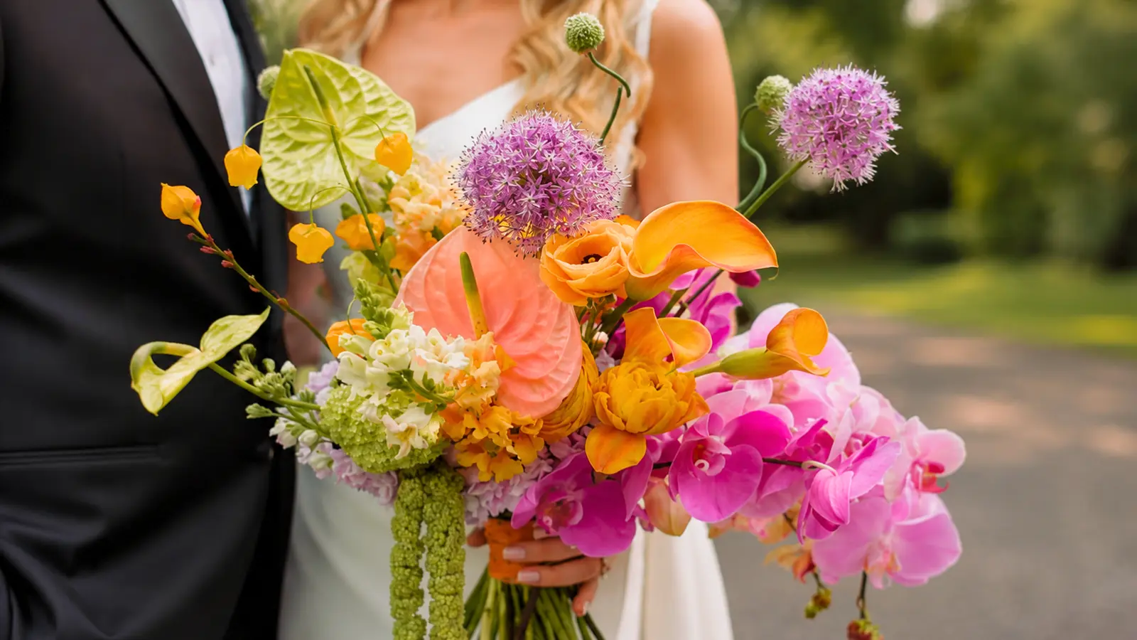
Colorful wedding bouquets are perfect for brides who want their flowers to feel joyful, expressive, and full of personality. From soft coral and sunny yellow to dramatic jewel tones and vibrant mixed-color arrangements, colorful bouquets create a striking focal point while allowing you to reflect your wedding style through carefully chosen flowers and palettes.
The challenge with wedding bouquet colors isn’t choosing beautiful shades—it’s combining them in a way that feels balanced rather than overwhelming. A successful colorful bouquet depends on thoughtful color hierarchy, seasonal flower selection, and the right mix of textures, allowing every bloom to contribute without competing for attention.
This guide explores colorful designs within the broader world of wedding bouquets, including bright bouquet ideas, jewel tone palettes, coral and yellow flowers, rainbow-inspired arrangements, and practical advice for building a bouquet that feels vibrant, cohesive, and beautifully designed.
Colorful Wedding Bouquet Ideas
Colorful bouquets aren’t one category — they cover a spectrum from soft and warm to bold and saturated, and the right direction depends heavily on venue, season, and the overall palette of the wedding day. Understanding where each style lands before you talk to a florist makes the conversation significantly more productive.
| Style Direction | Core Colors | Best Suited For |
|---|---|---|
| Bright and bold | Hot pink, red, cobalt, sunshine yellow | Outdoor summer, garden ceremonies, modern venues |
| Jewel tones | Amethyst, emerald, sapphire, topaz | Formal ballrooms, fall and winter, candlelit settings |
| Warm spectrum | Orange, coral, peach, golden yellow | Fall outdoor, bohemian, late-afternoon ceremonies |
| Soft brights | Butter yellow, soft coral, blush-pink | Spring garden, romantic outdoor, bridesmaid coordination |
| Mixed rainbow | Multiple colors across the spectrum | Maximalist weddings; requires careful lead-color structure |
The warm spectrum direction — orange, coral, peach, and gold — is the most versatile within the colorful category, since those tones sit naturally with the ivory and champagne tones common to many wedding days. Bright and jewel-tone directions are bolder commitments that reward deliberate pairing with venue and dress.
Bright Wedding Bouquets
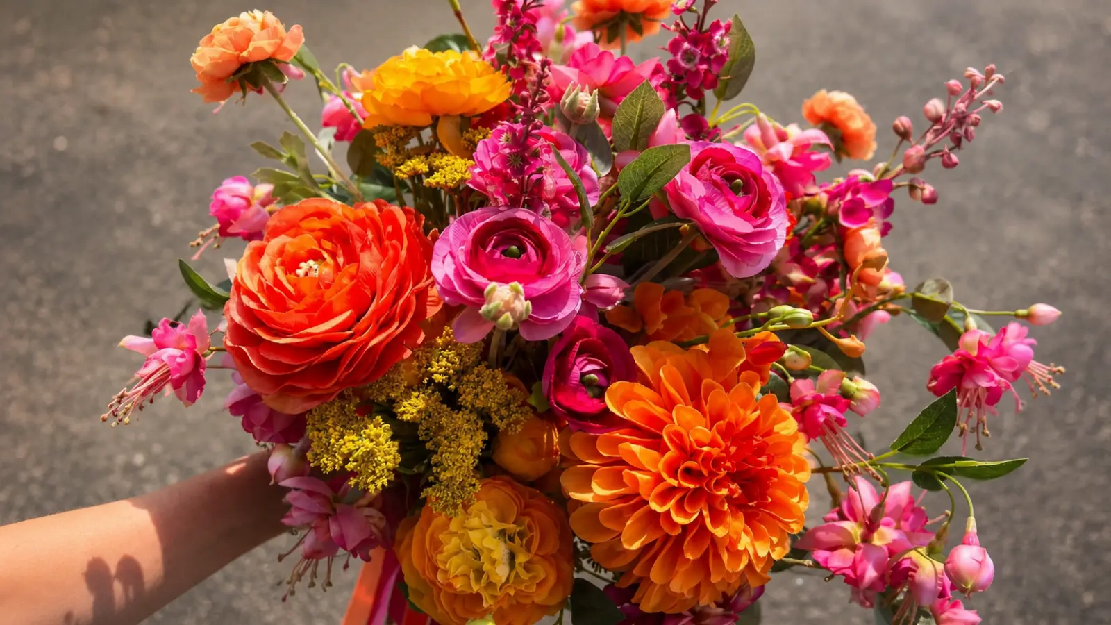
A truly bright bouquet — hot pink peonies, cobalt-adjacent anemones, vivid yellow ranunculus — is a specific aesthetic choice that requires confidence in the full visual context of the wedding. Done well, it’s joyful in a way that restrained palettes simply can’t replicate. Done without enough structural thought, it can read as loud rather than vibrant.
The wedding bouquet flowers that carry saturated, vivid color most reliably include ranunculus, garden roses, anemones, dahlias, and zinnias. These hold their color intensity well through a long ceremony and photograph without turning flat or washed out under most conditions. Tulips offer vivid color in spring but are more temperature-sensitive and have a shorter lifespan outside water. Poppies add drama but are among the more fragile bright choices for a full wedding day.
Bright Bouquets and Photography
One practical consideration that doesn’t come up often enough: bright colors behave differently in photographs depending on the light. Very saturated yellows and oranges can blow out or lose detail in strong midday sun, while they look rich and dimensional in golden-hour or diffused light. Hot pinks and magentas sometimes shift in color temperature depending on the camera settings. If you’re building a bright bouquet and portrait photography matters to you, it’s worth asking your photographer when and where the main portraits are planned, and sharing that information with your florist. A knowledgeable florist can help you choose colors that will look as vivid in your photos as they do in the shop.
Bright bouquets also tend to benefit from a generous proportion of greenery — not as a way to soften the color, but to give each bloom visual space to read clearly. When bright flowers are packed too tightly without any foliage separation, they can merge into a solid block of color rather than a layered composition. Muted, darker greenery works better than bright green here, since it recedes rather than competing with the flowers.
Jewel Tone Wedding Bouquets
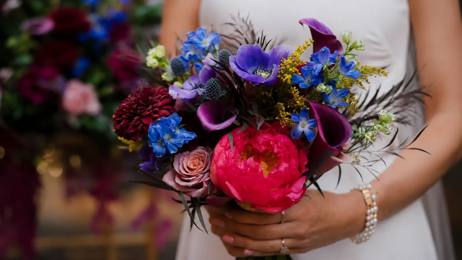
Jewel tones are the most formal direction within colorful bouquets. Deeply saturated amethyst, emerald, sapphire, and ruby shades have a richness that reads elegantly in candlelit ballrooms and formal venues in a way that brighter, more casual colors don’t. They’re a strong choice for fall and winter weddings in particular, where the depth of the palette feels seasonally appropriate rather than at odds with the setting.
Building a jewel tone bouquet requires a clear understanding of which flowers can actually deliver these colors reliably. True emerald green doesn’t exist in most cut flowers — it’s typically achieved through green trick dianthus, green button mums, or foliage-forward designs. Deep amethyst is well represented in lisianthus and certain dahlia varieties. Sapphire blue draws on delphinium, eryngium, and the deeper anemone varieties covered in more detail in the blue bouquet guide. Deep ruby and wine tones are the most flower-rich category, with garden roses, dahlias, and ranunculus all offering strong options.
Keeping Jewel Tones from Reading as Dark
The common failure point with jewel tone bouquets is that they can lose definition and read as uniformly dark, especially in photos taken in lower light. The solution isn’t to lighten the palette — it’s to make sure the individual colors within it are distinct. Two or three clearly different jewel tones in the same bouquet read better than one deeply saturated color used throughout. A few stems of a lighter neutral flower (ivory or blush ranunculus, for example) give the eye a point of reference that lets the jewel tones appear richer by contrast rather than flatter. Dark, matte-finish greenery like ruscus or olive branches reinforces the palette’s depth without adding another competing color.
Orange and Pink Bouquets
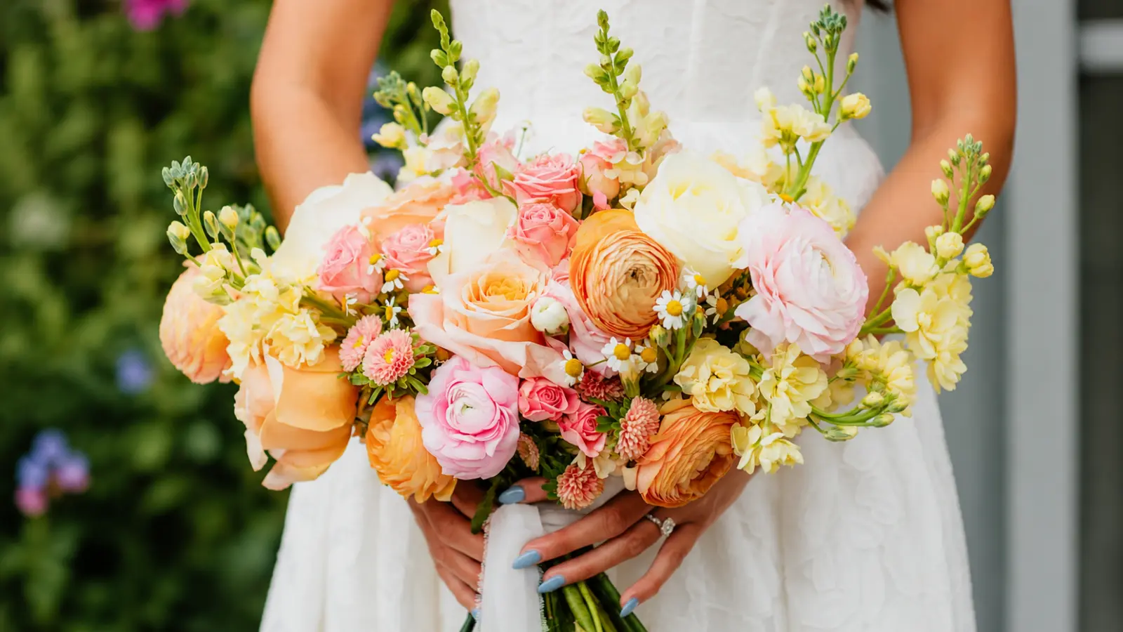
Orange and pink is one of the most energetic combinations in bridal florals — and one that requires the right instinct about proportion. These two colors are warm and high-contrast enough that the relationship between them determines whether the bouquet reads as vibrant or clashing.
The combinations that work most reliably pair the warm, coral-leaning tones found in pink wedding bouquets with a true orange, rather than placing cool-toned pink beside it. A cooler pink (closer to fuchsia or bubblegum) creates a harsher contrast with orange that reads as less intentional. A warm blush or coral pink, on the other hand, sits closer to orange on the spectrum and creates a more harmonious transition between the two tones.
| Combination | Effect | Best Flowers |
|---|---|---|
| Orange + warm coral-pink | Energetic but cohesive; the tones share warmth | Orange ranunculus, coral garden roses, blush spray roses |
| Orange + hot pink | Bold and graphic; high contrast, needs a neutral buffer | Orange dahlias, hot pink peonies, white or ivory accent |
| Orange + blush | Softer warmth; the blush pulls orange toward romantic | Orange garden roses, blush ranunculus, ivory spray roses |
A neutral buffer — ivory, cream, or white — is particularly useful when orange wedding bouquets include high-contrast pink accents. It gives the eye a visual break between the two strong colors and prevents the bouquet from feeling like it’s competing with itself. Even three or four ivory ranunculus distributed through the arrangement can shift the overall reading from busy to balanced.
Yellow Wedding Bouquets
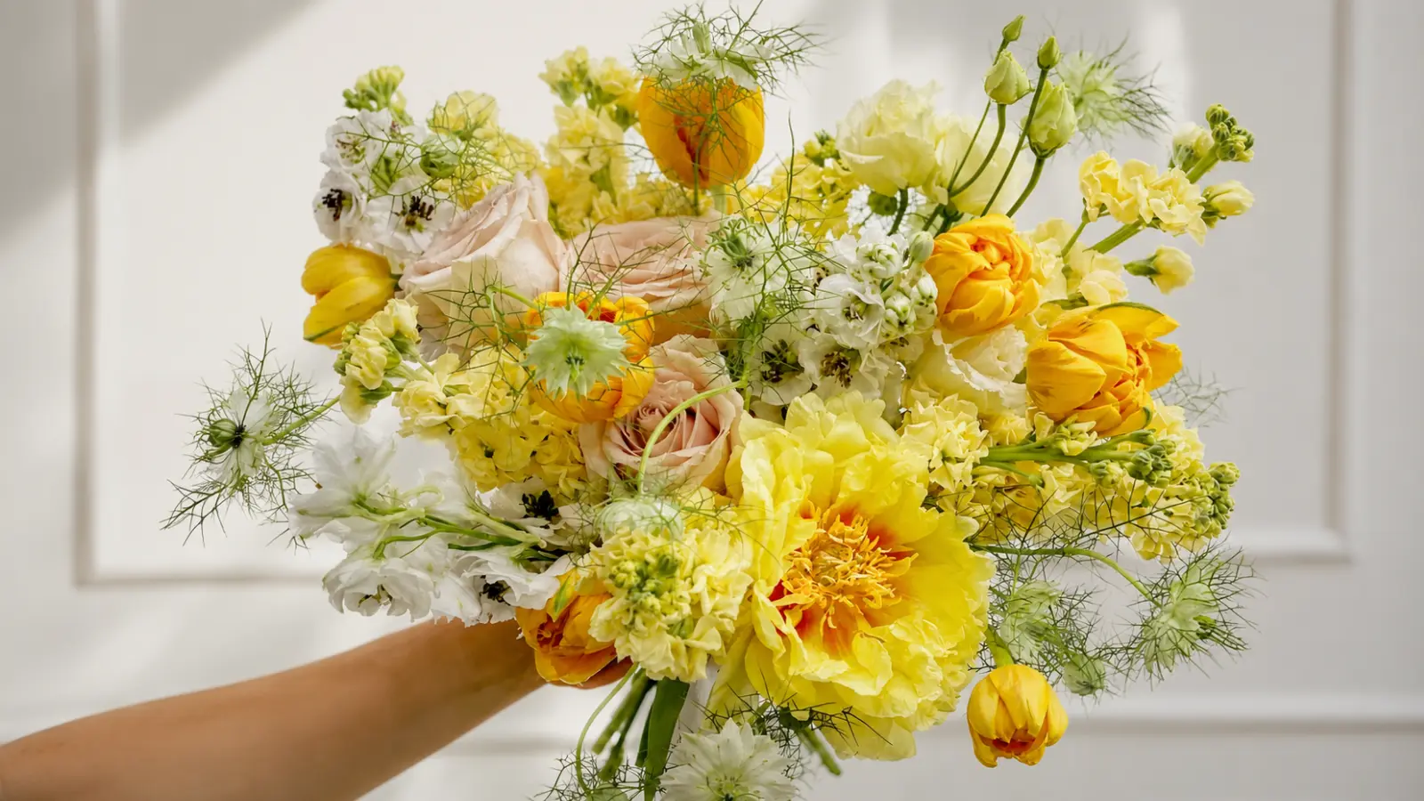
Yellow has moved steadily into the mainstream of bridal florals over the past several years, and it deserves more credit than it typically gets. It’s one of the most joyful colors in the flower palette, it photographs beautifully in natural light, and it has more range than brides often expect — from the palest, almost-white butter yellow to a deep, saturated golden ochre.
The exact shade matters significantly in yellow wedding bouquets because it changes how the color reads in a wedding setting. Soft, butter yellows feel romantic and light, and they suit spring garden weddings and bridesmaid coordination with particular ease. Golden yellows feel warmer and richer, which makes them natural for fall settings and late-afternoon ceremonies where the ambient light already has a warm, amber cast. Bright, primary-leaning yellows are the most graphic and suit modern venues and maximalist brides who want the bouquet to be clearly, deliberately bold.
Yellow Flower Options by Season
Yellow is well-represented across seasons, though the best specific options shift depending on when the wedding falls. Ranunculus and garden roses are the most reliable year-round choices and come in a strong range of yellow shades. Dahlias offer exceptional golden yellow options in late summer and fall, including the Café au Lait varieties that trend toward warm, neutral yellow-beige. Sunflowers are peak summer and bring a completely different scale and texture to the composition. Tulips are the strongest spring option for saturated yellow, though they’re more temperature-sensitive than roses or ranunculus.
Yellow pairs naturally with white, ivory, and deep green — a combination that almost always reads as fresh and intentional rather than trying too hard. For brides who want more warmth, layering yellow with peach or coral creates a bouquet that feels genuinely sunny without being one-note. Pairing yellow with deep navy or indigo is a bolder, more graphic direction that suits modern venues and brides with strong aesthetic confidence in their choices.
Coral Wedding Bouquets
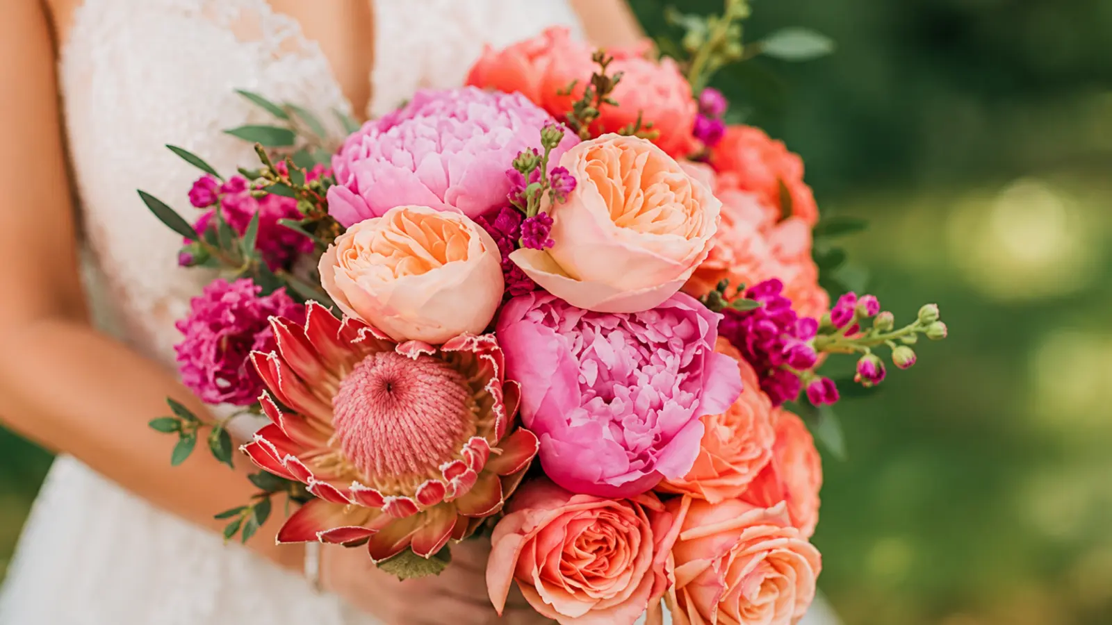
Coral occupies a specific and valuable position in the colorful bouquet spectrum. It’s warmer than pink, softer than orange, and more versatile than either — which makes it one of the more practical choices for brides who want clear color in their bouquet without the boldness of a fully saturated shade.
The practical advantage of coral is how naturally it sits alongside the warm neutrals that already exist in most wedding palettes. Ivory dresses, champagne tablecloths, wood-toned venue details — coral integrates with all of these without requiring major adjustments to the surrounding palette. It also pairs well with greenery in a way that orange sometimes doesn’t: coral next to deep green reads as lush and botanical, while orange can occasionally compete with greenery for visual dominance.
Coral Shades and What They Signal
Like most colors in the floral world, coral has a range. Lighter coral shades lean toward peachy blush, which reads as soft and romantic and pairs easily with pastel and neutral palettes. Deeper, more saturated coral shades lean toward orange and create more visual energy — better for ceremonies where color is meant to be the statement rather than the complement. A florist worth working with will show you the actual stems in the specific shade you’re considering rather than a color name that can mean different things across varieties and seasons.
Ranunculus is the most reliable source of true coral in cut flowers, with a wide range of naturally occurring shades from pale peach to deep burnt coral. Coral charm peonies are among the most requested coral flowers in wedding florals, though their availability is tied to a mid-spring season. Garden roses in coral and apricot shades are available for a longer window and hold up well through a full wedding day.
How to Choose a Colorful Bouquet Palette
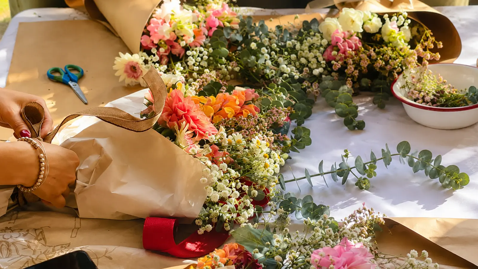
Most brides approach colorful bouquets with a list of flowers they love. Most florists work better with a color structure. The gap between those two starting points is where colorful bouquets most often go sideways — not because the flowers aren’t beautiful, but because no one has decided which color is in charge.
The most useful framework for building a multi-color bouquet is simple: one lead color, one accent color, one neutral anchor. Each element has a specific job.
| Element | Role | Approximate Share of Bouquet |
|---|---|---|
| Lead color | The color the bouquet is about; what the eye goes to first | 50–60% |
| Accent color | Creates contrast and interest; should complement, not compete | 25–30% |
| Neutral anchor | Gives the eye a resting point; keeps the palette from feeling busy | 10–20% |
This structure works across every colorful direction. A bright bouquet with hot pink as the lead, orange as the accent, and ivory as the anchor reads as bold but controlled. A jewel tone bouquet with amethyst leading, deep teal accenting, and blush anchoring reads as rich and layered rather than dark and heavy. What makes the framework useful is that it forces a decision about hierarchy before any individual flower is chosen.
Matching the Palette to the Full Wedding Day
A colorful bouquet that looks spectacular in isolation can feel disconnected from the wedding if it doesn’t share any tones with the rest of the day. The most effective approach is to pull the bouquet’s lead color from an element that already exists in the wedding: a bridesmaid dress color, the venue’s natural tones, an accent from the invitation suite, or even the dominant color of the ceremony backdrop. This doesn’t mean matching exactly — it means connecting, so the bouquet reads as part of the same visual story rather than a separate element carried by the bride.
What to Tell Your Florist
Florists work best when they understand intention rather than just flower names. Instead of arriving with a list of six specific blooms, try describing: the lead color and roughly what shade within it, the mood you’re going for (romantic, graphic, joyful, sophisticated), the venue and time of day, and one or two things you definitely don’t want. From that brief, a skilled florist can build a palette that achieves your vision using whatever is best in season rather than being locked into flowers that may not be performing at their peak.
Mistakes to Avoid
Colorful bouquets have a specific set of failure points that don’t apply in the same way to neutral palettes. Most of them trace back to the same source: treating all colors as equally important, which leaves no one color in charge.
Using too many colors without a dominant lead is the most common issue. Five equally weighted colors in one bouquet don’t create a multi-color composition — they create visual noise. Deciding which color the bouquet is about, then building everything else around that decision, is the structural move that separates colorful-and-cohesive from colorful-and-chaotic.
Ignoring the dress tone when building a warm palette is another issue that shows up clearly in photos. A bright orange or yellow bouquet held against a cool-toned white dress creates an unintentional color contrast between the dress and the flowers that can read as clashing. Warmer ivory and champagne dresses sit more naturally with warm palettes. If the dress is cool-toned, the bouquet colors may need to either be cool-toned as well, or include a neutral buffer that separates them visually.
Choosing flowers purely for color without checking seasonal availability creates sourcing problems that a florist will catch — but only if they know what’s expected. Some of the most vivid, saturated flower colors are seasonal. Asking your florist what’s at its natural best during your wedding month, then building the colorful palette around those options, consistently produces better-looking bouquets at more accessible prices than insisting on specific off-season varieties.
Colorful Wedding Bouquet Inspiration
Discover colorful wedding bouquets featuring bright seasonal flowers, jewel tone palettes, coral and yellow blooms, vibrant rainbow-inspired arrangements, and modern floral inspiration for every wedding style.
Beautiful Color Starts With Balance
Colorful wedding bouquets are memorable not because they use more colors, but because every color has a purpose. Whether you love bright summer flowers, rich jewel tones, or warm coral and golden palettes, the most successful bouquets are built around balance, contrast, and thoughtful composition rather than simply adding as many shades as possible.
The best colorful bouquets begin with a clear vision. Choose a lead color, support it with complementary tones, and let seasonal flowers guide the final design. When every element works together, a colorful bouquet becomes more than a collection of beautiful flowers—it becomes one of the defining visual details of your wedding day.
Frequently asked questions (FAQ)
How do you make a colorful wedding bouquet look cohesive instead of chaotic?
The most successful colorful bouquets follow a clear visual hierarchy rather than giving every color equal importance. Choose one dominant color, one supporting accent color, and one neutral anchor such as ivory, cream, or white. This structure creates movement, contrast, and balance while allowing every flower to contribute without competing for attention.
What flowers work best for a colorful wedding bouquet?
Ranunculus, garden roses, dahlias, tulips, anemones, lisianthus, and zinnias are among the best flowers for colorful bouquets because they naturally occur in a wide range of vibrant shades. Mixing different flower shapes while keeping the palette controlled creates more visual interest than using many colors with identical flower forms.
What is a jewel tone wedding bouquet?
A jewel tone bouquet features rich, saturated colors inspired by gemstones, including emerald, sapphire, amethyst, ruby, and topaz. These bouquets create a luxurious, dramatic look that works especially well for formal venues, candlelit receptions, and fall or winter weddings. Dark greenery reinforces the depth of the palette without introducing unnecessary visual competition.
What colors pair best with an orange wedding bouquet?
Orange pairs beautifully with ivory, champagne, peach, coral, burgundy, and deep green. Warm neutrals soften orange while preserving its energy, and darker tones such as burgundy add richness without overpowering the bouquet. Using orange as the clear lead color produces a stronger design than allowing multiple warm colors to compete equally.
Is yellow a good color for a wedding bouquet?
Yes. Yellow is one of the happiest and most light-responsive colors in wedding florals. Soft butter and lemon yellows feel romantic and fresh, while deeper golden shades complement autumn weddings and golden-hour ceremonies. Choosing the right yellow for the lighting conditions helps the bouquet maintain its richness in photographs throughout the day.
What is the difference between coral and orange in a wedding bouquet?
Coral blends pink and orange into a softer, warmer tone that feels romantic and highly versatile. Orange is more saturated and visually energetic, making it a stronger focal color. Coral integrates naturally into neutral wedding palettes, while orange creates a bolder statement and benefits from careful balancing with softer supporting colors.